Thursday, November 26, 2009

Journey's End Oct 24 - 25 A Celebration - Part II

Part of my journey contract was also that I would write a weekly blog about my journey. I really didn't quite keep up the weekly bit, but I really did amaze myself that I did manage to write over 55 blogs - this is the 56th in 18 months or so.

In fact writing the blog has been really valuable for me - it helps me to focus on my work. By reading back from time to time I can see various stages in my progress. Another thing that it has done for me is to get me to take photographs of my pots - a really valuable record. As I look back over the old postings I can see various stages of my work - some good and some bad, but at least I can review them and learn from them.

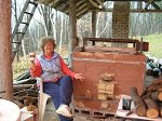
So back to the Journey celebration weekend - unfortunately I did not take very many pictures - was too busy having fun!

Saturday morning we were treated to a short workshop on photographing pots. I must say this was the best talk on this subject that I have ever heard. Steven explained his setup to us, explaining where he got his equipment and how he used it. Not being a professional photographer himself, there was thankfully not a single mention of f-stops, etc - all the stuff that I can never understand no matter how hard I try.
He also took some pictures of our pots with his setup and in the evening we saw them on the computer - what a difference a great photograph can do to make a pot look great! I came home eager to get a something similar. Steven should really offer photography workshops as well - they would be well worth it.

In the afternoon the gallery was open and since Rob, Lindsay and Sarah lived in the area or had relatives living close by, there was a great turnout!


I really liked the lighted shelves that Steven had in his gallery - they really did a great job displaying the pots - as seen in this photo of my two fishing lady/boat pots.

Over a pizza supper we celebrated our accomplishments. Two art teachers/potters stayed for supper and it was very interesting to talk with them as they were involved with the Potters for Peace project - making water filters in Third World countries - something that has always interested me.

Sunday came way to fast - and it was time to say goodbye after a fabulous breakfast! Thank you Steven for a great journey! And thank you all, including Kim and Richard for making this such a great weekend! I hope that we can continue to follow each others' work and see how we develop.

This will be the last post under the Steven Hill Journey Workshop July 2008-09. However I am not giving up my blogging. I think I will continue this blog under a new name - Centered - Reflections on From and design or something like that - as I think writing down my thoughts about my pots will be a big help to me, even more so now that I do not have a monthly critique deadline.

However Steven offered us a chance to continue with the journey - either with another journey ending in a gathering in Oct 2010 or with just monthly consultations. Although I would love to go back next Oct, the airfare from Canada makes it rather expensive for me, so I will save that airfare for sometime in the future for another of Steven's workshops like the pouring vessel's and cups one.

However I am opting for the monthly consults which I hope to start after Xmas. I think that Steven will be able to help me define new goals for myself and those monthly critiques will keep me focused on those goals.

Monday, October 26, 2009

Journey Oct 19 - 23 Journeys End - A Celebration! Part I

Well I got all the pots packed - the 4 plates were stacked and packed into a cloth bag for carry-on. It should fit under the seat, though I hope not to have too much walking as the pots are really heavy. I dread the Chicago airport - coming from Ottawa I am not used to these huge airports with miles of terminals.

After a delay due to bad weather at the Chicago end my plane arrived 2 hours late. Fortunately my fellow journey women, Ann and Marion had not given up on me and I was able to share the rental car with them to Center Street Clay.

It was a great to be back - some changes though with Kenyon replaced by the new resident Richard who has hair just like my son and in fact in profile looks just like him. It was amazing!

Steven got us all to work, unpacking our pots and getting them into the studio. Looking at his agenda sheet we saw we were in for a busy weekend! It was great to see Lindsay and Sarah again and to see all the progress that everyone had made in a year. Ann and Rob had been in the Oct 08 workshop so this was the first time that I had a chance to meet them and see their work.

After a great chili supper with corn salsa we talked about our pots. We had to number and price our pots and with a list take them up to the gallery. I priced my big wall plate higher than the appliqued vases even though in terms of work, vases take way more time. But plates sell at a higher price - as they are considered wall art and so people will pay more for them.

Friday morning we all got together in the studio to talk about our individual journeys while Kim set up the gallery with our pots. It was interesting to hear what everybody else had gotten out of their year long experience. I think we all felt that this had been a very worthwhile experience and it had definitely changed our work for the better. Steven remarked to me that he had looked at the pictures of my pots when I had applied and what a difference a year had made!


In the afternoon we gathered in the gallery for critiques. Here is my corner with some of my pots. I think that I reached part of my journey goals and that was to develop a more unified look, concentrating of form and design. However the other part to develop an appropriate palette for the forms - I think I still have a long ways to go.

I still need to improve my spraying - I need more control when changing colours and perhaps an airbrush would help. Also it always seemed to me that there was something not quite right with my fish plates and Steven felt that the fish looked like dead fish on sand - so I will try a blue version of the stony yellow on the fish area. The stony blue should be a more subdued blue than the blue ash.

I found that whenever I tried to use the blue ash the rivulets competed too much with the fish stamp and the design was lost. As well when the stamped design is done in a darker colour you also seem to lose it. An impression done in a lighter colour makes it stand out, especially when you have some contrasting color in the impression.

That evening we went to the national juried Clay3 (clay cubed) exhibition. Sarah, one of the journey participants had two of her pieces in the show. All pieces were exhibited in 1 foot plexiglass cubes and made for a very effective display. No iron speckled pots (my favorite!)in that show! My favorite was "Overlapped Bowl on Pedestal" - handbuilt and soda fired by Marcia Tami Paul. Some really great pieces and lots of new ideas. I liked the little cricket cages as something new. There was also a great talk by Mary Kay Botkins, who was the juror.

To be continued.

Saturday, October 17, 2009

Journey Oct 11 to 18th Time to pack!


This week was the last firing for my journey and the kiln opening was on Wednesday. I thought that I finally had a winner in the fishing lady pot - the appliques were simplified (no applique where I will have runny blue ash!), the glaze all the right thickness and in the right spots. However a few hours after unloading I examined the pot more closely and saw that there was shivering on the rim! The replacement blueberry pot which did not have good glazing again - however had no shivering.

What had happened I think was that I had sprayed white and blue slips on the greenware pot to brighten the colours a bit on the stoneware clay. However once bisqued, I realized that I had too much blue (I had been tying to tone down the blue - so what was I thinking spraying on blue slip?)and so resprayed again with a thin layer of the white slip. I had used the slips on bisque ware before with no problem, but I think the second time the slip did not stick as well to the bisqued slip layer and so there was some shivering on the rim. However I had used Tuckers Smoothstone which has a lower expansion than their other clays so that could have had an effect.


The blueberry picker which had the same treatment with slips still has not shivered -and it was out of Smoothstone as well. So not sure what is going one. As I was in a rush to get this pot finished I did not applique on a person - just the blueberry bucket. I think maybe it leaves more to the imagination this way- still have the spilled blueberries and shoe on the back.


The landscape plate - I finally got some of the Hannah Ochre ash to run - this complements the runny blue ash . The problem has been that if there is any Stony Yellow present under the Hannah Ochre it stops the rivulets from forming. When I spray I try to get intermingling around the different glazes and so the Stony Yellow tends gets under it. This plate was the one that turned out the best - unfortunately it had cracked on the foot.

I spent yesterday trying to figure out how I will pack the pots - I will carry on the plates, put one of the fishing lady vases into a computer bag. Then I found a hard sided suitcase that was being thrown out by the second hand store next to our Potters Guild and it will hold 2 largish cardboard boxes. My soft sided suitcase will hold another two cardboard boxes. By surrounding the boxes with bubble wrap and clothes I should end up with the double box effect necessary for safe transport. I do have a direct flight to Chicago so that should minimize baggage handling.

Tuesday, October 13, 2009

Journey Sept 28 - Oct 10th One last firing left!


Well journey's end looms on the horizon. Looking at my stash of pots that I have I ready I find that I do not have any that I am really satisfied with to take to the final get together at Center Street Clay. If the glazing is good then the pot has a crack and if there is not crack then the glazing is bad. The few that I am satisfied somewhat with are the plates. Unfortunately all the large plates - 14" and up with the woman/fish ended up terribly glazed and it was only the small 10" one that only turned out OK.

In the last week I speed built replacements for the fishwoman and blueberry picker - building and speed drying the slabs pots in three days. They bisqued OK without any cracks except for a small one on the rim of the blueberry picker which I tried to mend by rubbing in a patch of sodium silicate with bisque dust. I also added an extra layer of glaze to see if that would also cover the slight crack.

The kiln opens tomorrow morning and we'll see. I need about 10 pots I guess - about 3 or 4 major ones with some smaller ones. Pots that show a unified look - as that was what I was looking for in this journey.

Sunday, September 27, 2009

Journey Sept 21 - 27 More Burnt Toast

Well after the August firing where all my glazes were too thin, I tried harder to watch how I was spraying. The resprayed pots looked a bit better, but still like burnt toast. I had really liked the applique on the woman and fish pot - tried to simplify the applique, but I must remember that the drippy ash glazes are distracting on the wavy applique areas. The back would have been fine with just the ash and no fish to distract. Also the dark brown area of very thin glaze could use another coat but I am afraid to refire again as the ash may run down too far. The pot looks better in the pic that in reality as the white background seems to simplify it.


New pots - some where not much better. Somehow the stony yellow did not come out very well and the Hannah blue was too strong. I have changed clays - using the paper version of Sandstone - maybe that made a difference, though I doubt it. I think the firing was rather muddy - I didn't get to reox at the end until after cone 9 was halfway down as the firing was rather fast. I had to slow it down and hold cone ten for an hour or so. Usually I start reox once cone 8 starts so I get about 2 hours of reox instead of one - I think this of what Steven does. Anyway I feel it has made the colours brighter especially the ash glazes.


The blueberry picker pot had one great effect and that was the blue ash runs on the front giving the effect of masses of blueberry bushes in the woods. However the stony yellow around the figure was too thin and resulted in mottled effects that distracted from the figure. The back had too much brown, was trying for a sun effect - either rising or setting, over the blueberry bushes, with a spilled bucket and shoe in the bottom corner - trying for that slightly menacing effect of my mother's painting.


The landscape pot - I liked the front top and the stick like figures, and how all that got glazed, but again it fell through with the long wavy appliques and the drippy ash glazes. The blue in that bottom area was distracting so should maybe have stayed mostly with the brown colour schemes and just had the blue in the upper part.

Well I have one more firing before journey's end at Center Street Clay on Oct 22- 25 - so hope to get something that I am pleased with. Right now I like my pots best just in the greenware stage.

Friday, September 18, 2009

Journey Workshop Sept 14 - 20 Paper Clay Pots


Well I have been having problems with some cracking on my hand built pots so decided to try some paper clay - made from Tucker's Sandstone - the same as my regular clay. I was amazed how strong the slabs were and so I could make them a lot thinner. Whenever I start on a hand built pot I usually need to let the form sit around for a while while my mind churns over various applique designs.

However I did find the paper clay was harder to cut once it was leather hard and even the applique, if very fine detail was required, was harder to cut out. However I really like the way I could add to the rim and base to thicken it. We'll see how it fires and glazes.


The first pot was another fishing lady and the second was a landscape-like decoration. I thought that I would take a picture of the raw glazed pot before it gets ruined in the glaze firing. My last firing at the end of August was a total disaster - the sprayed glazes were too thin on all the pots and so they had to be all reglazed.

The tops were fun to do - definitely I find the wavy tops really enhance the design. What a change from pre-Steven when I felt I needed a plain straight top so as not to distract from the applique design.

Journey Workshop Sept 1 - 13 Do You Want to Fit In?


Something that Steven said to me in July still sticks in my mind. It was when we were discussing being contemporary or not. He asked me "Do you want to fit it?"
I guess that I have a unique style and I have always been an individualist - going my own way and doing things my way. So I guess even though I love those wonky, altered pots they are not really me. So is it better to be true to myself than to surrender myself to the latest fashion? I have been trying to be more contemporary and so have been whacking pots a bit, altering them etc - but would I have done all those things it I had not seen them done by others? So I guess part of me does want to fit in.


I made some more watercolour water pots, vases, cups and garlic garlic pots - after several variations I came to a point where every ting finally clicked nicely together - I have never had that feeling before - definitely could say that the designs were finally totally resolved - to my mind anyway. What I like about these is
1. appliqued window on my garlic pots and vases - ties in with my other applique work,
2. oval shape and a whack down with the end of a stick gives it a bit of life and a contemporary look,
3. pushing up the foot in front of the whack to give it movement
4. adding the clay button on lids (to designate the front for better fit) off centre to emphasized the end of the stick impression,
5. the curled knob with stick impression on side to tie lid to garlic pot.
6. On the water pots I also pushed out the sides at the bottom to give it a more oval shape and to emphasize the stick impression and kanthal wire addition.

Monday, September 14, 2009

Journey Aug 9 to Aug 30th - Cutesy with an Edge

It's funny how quickly it is easy to get out of the habit of writing this blog - a 2 week stint at MISSA and I have fallen way behind and it is so hard to remember what I have been doing. I also find that when I was writing regular weekly blog I was also much more focused on my work and journey goals. And its been an invaluable record. I regularly go back and read bits of it for inspiration whenever I get stuck.

Because of other things intruding - like visitors, gardening etc. I cancelled my August critique with Steven as I still not not have much new stuff and no time to put up pictures on Flicker.


The end of July - beginning of August is blueberry time in our area and you see pickers by the highway. It always reminds me of a large painting (about 5 feet x 5 feet) that my mother had painted years ago of some blueberry pickers She never liked the picture and kept it in the basement with the face against the wall. I felt there was something always a bit spooky or threatening about it, so it was never a favorite of mine either.


However our daughter has always liked it and recently hauled it away to her home. I decided to use that painting as an inspiration as I felt I needed a break from the fishing/boat pots. The back of the blueberry picker pot just has a shoe and spilt bucket of blueberries - so as my friend said when she saw it - "cutesy with an edge".

Monday, September 7, 2009

Journey July 26 - Aug 8 - Our job is to make good pots

As I had been away at MISSA, I did not have too much new work to discuss for my July critique.

I had donated one of the fish plates to the student auction at MISSA. Looking at my pot among the other pieces of ceramics on the donation table I was struck that my piece did not have that contemporary look - it looked out of place and time somehow.
Anyway I discussed this issue with Steven at my July critique - how I was still not satisfied that my work looked contemporary enough. His response was that it is not our job to be modern, but to make good pots. He felt that I had been doing a good job so far in integrating various design aspects of my pots.

I guess one of the reasons that some of the pots look dated is in the stoneware clays that I use to get the iron spots (which I love!.


Steven also mentioned that definitely some of the glazes and colours - the beige and browns are more from the 70's so if I wanted to be more contemporary I should bring in some more colours. Perhaps for the handbuilt pieces use B-mix with grog rather than the stoneware.

Wednesday, September 2, 2009

Journey Workshop July 21 to July 26 - Back to my Journey Goals

Well with MISSA over it has taken me several days to get back onto track of working on my "journey" goals - getting a more unified look on pots that really excite and satisfy me.

I started throwing some larger pieces in bottle shapes, with the intent of adding applique work. However I found that shapes with a belly just do not look good with that type of decoration - the belly protrudes and appliques just sticks it out more. So I ended up making bottles with more oval shape, and adding a slab bottom. The flattened side provides a canvas. I often try out designs first with paper cutouts.


At MISSA on the bellied bottles,(see the bottom photo)- instead of hitting the foot with a stick, I decided to stomp down on the foot with the end of a stick and this gives a different look that I like. I also sometimes added a clay button first and then stomped down. Once home I have carried through with this method on my paint pots, bottles, vases, cups etc. and I'll see how I can integrate this into my other designs.

Sunday, August 23, 2009

Journey Workshop July 5 to July 20th - Time out from my Journey Workshop for MISSA


After all my troubles with throwing large platters and Steven's comment saying that he was surprised at the trouble that I was having - I decided that I needed more throwing practice and instruction. As I have always wanted to attend a workshop at the Metchosin International Summer School of the Arts just outside of Victoria BC and I saw that Tony Clennel was giving a 2 week throwing workshop there I got all my pennies together and signed up. It was a fabulous experience - Tony Clennel's 2 week course on throwing was just what I needed to get my work up another notch - getting larger in scale, doing handles and paper resists. I highly recommend him for a workshop!

As a bonus John Britt was there doing his glaze course, and there were two raku courses - one with Joe Brecha and the other with Randy Brodnax who demonstrated one evening his throwing techniques. Awesome!

I also took the weekend workshop with Dennis Meiners on textured slabs. As you could wander around to all the other classes I also got to see some of the extruded work by Bill Shinn and the handbuilt paper clay sculptures of Rory McCrory. All this in a paradise setting of Vancouver Island's old growth forest. The building above houses the three pottery classrooms. Our throwing sessions were held on the ground floor classroom.

Here are some of the things that I learnt at MISSA - in no particular order.

1. "If you don't like glazing your pots will show it" (Dennis Meiners). I think he hit the nail right on the head. However how do I get to like glazing? Spraying and overlapping glazes is helping in that respect as it is sort of like painting watercolours.

2. To get rid of an air bubble prick the wall all the way through to the other side.(Tony Clennel) As I am an impatient wedger I often get air bubbles and this solution works well on some of those really stubborn ones.

3. Tony's method of throwing secitonal pots. Throw the bottom section. Let dry a bit and then throw the next section, placing it right away on top, by flipping it by holding onto the bat. Press the sections together and then wire off the bat from the top section. Continue forming the pot. Tony suggests that you do a join where the pot form changes and that will hide any join mark. Before I would let both section set up. This way with the top section being fresh, it is easier to continue forming the shape and so you get a better form.

4. Handle attachments do have a lot of potential for expression. (Tony Clennel)
I have always liked Tony's expressive handles as well as how he treats his attachments, often putting on a "bandaid" over one end of the attachment. See picture of Tony's demo casserole below.)


The asymmetry works well and this gave me lots of new ideas that I have been playing around with.

5. Use a towel, dryer sheet or other smooth fabric to round and smooth the cut edges of slab work to give it a finished look. (Tony and Dennis)I would always use just my finger or damp sponge, but the fabric works much better.

6. On a slab built teapot, place a small coil around the rim so that the lid is lifted a bit - gives a much more finished look. (Denis Meiners)

7. To get a green in reduction, spray on cobalt with a bit of iron and then a light spritzing of rutile on top. (Randy Broadnax) One of the problems in redux firings is that often copper turns pink/red and it is actually difficult to get a good stable green. Haven't tried the Co and rutile yet, but plan to.

8. Use tar paper templates to cut out your slabs and then put the pot together with the paper still stuck on. The paper supports the slab until they are all joined. (Tony Clennel) As I do a lot of hand building I am anxious to try this.

9. When cutting the lid on square closed hand built boxes, bevel the corners when cutting in the opposite directions from the sides. This is will form a lock so the lid does not slide off. (Denis Meiners)

10. Cedar bark makes great brushes. In one of the painting courses students made these great rough brushes from pieces of cedar bark by pounding the bark gently until it shredded. Seems like they would work for some very free loose slip decoration. I tried to find some bark along the shore, but no luck. I will see if our son can find some out there and send me some to try.

Friday, July 3, 2009

June 29 - July 4 June Gas Firing


Well this last firing was the best for me so far - finally no blistering on any pots.
The fish plates turned out great, though need a more subdued blue still. I seemed to have gotten a feel for the right spraying thickness finally. The line blend that I did with reducing the cobalt for the Hannah Blue Ash showed that instead of 1.5 % Co, if I use 1% it should tone down the blue. Any less and I get more green, but a army type of green, not very nice - as the glaze without colourants is an ochre colour.


The casseroles were done in several different glazes first two with stoney yellow and the bottom one with bone ash - but all with waterfall green brushed and then rubbed off to highlight the shellac resist and carvings.

Friday, June 26, 2009

June 23- 28 June Critique - How to thicken rims


The end of the journey workshop at Center Street Clay is on Oct 22-24. Probably just three more gas firings as summer visitors will take up some time in August so I really do not have too much time left. Steven suggested that for the gallery show I have 3 to 4 large pieces either slab or thrown and then several smaller items - again thrown or handbuilt.


I think that I need to take more pictures from more angles for my handbuilt pots as from some angles the form is not at all attractive, but it is hard for Steven to comment on that as he has no way of seeing it - though Steven said that apart from a definite front and back there will always be one view that is not as good as some of the others.

It is strange how completely my views have changed on decorating pots. Pre-Steven I only decorated one side - after all you cannot see all sides at once. Now I find that I just have to do the decorating on the back as well, in fact I enjoy coming up with something different but still meaningful for the back.


After all the talk on Clayart about form over decoration, I wanted Steven's view. It all depends on who you are - whether you focus first on form or on decoration, but in the end you still need to look at form and both have to work together.
I definitely know that I focus on decoration as I don't think that I have ever made an undecorated pot.

We talked about the last two slab pots that I had made - one where I had taken all the best features from each of my previous pots and attempted to make "super" pot. I had also combined shellac resist on the applique work so that it would tie in with the resist work on the plates and casseroles. Somehow i just cannot make applique work look right on plates, bowls and cups. Steven says that it is a matter of scale mostly. The appliques ends up overwhelming the pot.

I have had trouble with cracking rims - where I had added clay strips to the top edges to give the pot a more substantial look. The last two times instead of cutting leatherhard strips and adding them, I rolled a clay coil and applied it quite wet to the leatherhard clay top and voila - no cracking but it is hard to make the rim thickness even!


Steven suggested another method, rolling down the rim with a small clay roller. He used to do that on slab platters that he used to make. This compresses the clay as well as thickens the rim so it no longer susceptible to cracking. You can also use the edge of the roller to make a line along the rim, or perhaps on the appliques.


This sounds like a very interesting technique that I will have to try as the vase with the two ladies I had left the rim unthickened and it definitely did not look very good. As Steven said the base of the vase is quite substantial with the flaring at the bottom, but the top just is very weak. Another suggestion was to use an extruded rim like I had done on one of the vases - and perhaps not even having it all around the top but just on some sections. That sounded like it had lot sod different possibilities - maybe to accentuate a wavy pot.

One of the other journey participants had been to Centre Street Clay to take one of Steven's electric glaze firing workshops. That is something that I want to take as well. Steven has been getting amazing results in electric. Maybe I can persuade the guild in Ottawa to invite him to give a workshop. Will have to work on that.

Monday, June 22, 2009

June 15 - 22 "Batik" Type Resist with Underglazes


Well in one of my posts to Clayart I mentioned all the different techniques that I use, include "batik type resist with underglazes". A clayarter asked me to elaborate so I have included two pictures of 2 plates done a couple of years ago in that method and a brief explanation. They were done in oxidation fired to cone 7 1/2 and sprayed with Stoney White over non-commercial brown and blue underglazes. There is also a bit of overspray with rutile/gerstley borate and rutile/gerstley borate/red iron to give beige and darker beige highlights.

I refer to it as "batik" because you do it backwards as you would batik. First I wax all the areas where I do not want underglaze which is usually most of the pot. Then on the wheel I brush on the first base underglaze. Doing it on the wheel gives you an even coat. You also get little beads of underglaze on the waxed areas that add to the design. The beads kind of are reminiscent of the crackle lines that you get in batik.

I usually use a brown iron underglaze first. Then I wax the areas that I want to keep brown. So then I brush on the blue underglaze. If I wanted a third colour like green, I would wax out the areas that I want to stay blue and then brush on the green etc. I usually just use brown and blue. Now you have to rebisque to burn off the wax. So it is more time consuming but it gives a totally different effect than drawing directly. Try it and you will see what I mean.

I use this technique as I do not have very good drawing skills. I could let's say draw a flower in blue and brown underglaze but it would end up amateurish. By using the "batik" method I draw around the outline of the flower, the leaves, the petals, the stem and somehow that gives a very different effect and takes away some of the need to have good drawing skills - it adds a bit of naivety and simplicity. Not sure if that makes sense. In the 70's and 80's I guess that was my style, trying for a reduction look in electric. As I now have use of a gas kiln I no longer use this as much, though I am trying to find a glaze for cone 10 redux that would work with underglazes like the Stoney White.

Sunday, June 21, 2009

June 7-14 Contemporary is even harder!


One of Steven's comments about one of my pots was that the reason that he liked a particular pot better than another one was that the woman applique was more contemporary. It got me thinking - my influence was my mother as she is an artist and she loved to draw figures. Her favorite painters are Picasso and Gustav Klimt. Here are two of my favorite paintings that she did many years ago. After the 1970's she rarely painted any more as she had to look after my father who had had a stroke and so perhaps her figure style was somewhat dated, though I don' really think so. Sadly now close to 90 she no longer has the energy to paint.

I was determined with this last vase to make the appliqued figures more contemporary - perhaps with torn or unfinished edges - to give it a more abstract look. However it ended up even worse - over designed, too cutsy. In making these pots, I find that often even though I hate what I am making I find that I cannot help myself and cannot move away from the direction that I am heading.


The rim also has way too much stuff. I was not too satisfied with the wavy top and so decided to cut some out on the back - that was mistake! This is the first vase where I have not thickened the rim by adding extra clay strips. The thin rim just does not do much for the pot - just a bit too delicate.

Whenever I added leatherhard pieces to the rim, usually I got some cracking at the joint. So for the last two pieces I tried something new. I rolled out a coil and added it fresh to the rim. So far, the first pot - no cracks and next one comes out next week and we'll see!
Otherwise I'll have to start using paperclay.


So I have ended up with a vase with two women - I tried to make them look like they have berries. My mother years ago had painted a picture of women picking blueberries and so I thought I would maybe reference that. Sort of blueberry bushes at the sides and back. However it looks like a wedding instead.

Actually I may be contemporary in a social sense - a pot with two woman getting married!

Saturday, June 6, 2009

June 1 - 6 Trying to Pull It All Together


Well I have lined up along the living room window all the handbuilt pieces that I have made so far in my "journey" - landscape vases, fishing lady and fishing boat vases. I now have a flotilla! I tried to pick out what I liked best from each piece and then make an ulimate piece incorporating all these best features.


I decided to incorporate the following:
1. the tall shape was better than the longer boat shaped ones.
2. the kanthal wire "ladder rungs'.
3. a wavy top
4. some foreground slab for a 3-D effect
5. the figure has a fish tail
6. some cutouts in the foreground slab
7. simplified fish - one large fish as opposed to lots of little ones
8. wavy hair
9. When I glaze use the lighter pale yellow colour rather than the beige as it contrasts better with the blue.


After all this I am not sure if I really like it. I had used shellac resist and carving to make some of the pattern on the large fish and on the tail. It is the first time that I used this with the appliqued work and I find that I like it. However not sure that I like the whole piece - and after I thought I should have ended the tail not as a tail but as a large fish head as I had in another one of my pieces. It would have made for a more original and surprising picture on the back side.

Monday, May 25, 2009

May 25 - 31 Spraying is Hard to Do!

My spraying is improving! We talked how much concentration it takes for me to spray my pots - with all the different glazes and different thickness. I have to really pay attention to what I am doing and at the end of a spraying session I am beat. So different from before when I would just blast away with mostly one colour! Steven agreed. He also finds that spraying is the most difficult part of his process, while throwing is very relaxing.


In the fish plate that just came out this week I lost my concentration at the end and pressed the trigger a bit too hard blasting darker spots near the upper right hand side. (There is quite a bit of glare on the pot so it is not as obvious in the photo.) Once I realized what had happened, I tried brushing with a stiff brush to smooth out the spot and it might have helped a bit. The other alternative was to wash it all off and start all over again. In retrospect I should have washed it as I find that area really distracting and I had spent quite a bit of time decorating that pot.

The Hannah Blue turned out less harsh and I think it might have been due to some Stony Yellow spray on top. Again whenever I get some great results somehow I seem to have missed out in making notes on it. Note taking is hard to do as well - I definitely need to concentrate more on my notes!